Scientific mode
Available only in PyCharm Professional: download to try or compare editions
note
Scientific mode is enabled by default in PyCharm 2024.1 and later versions.
PyCharm allows you to perform scientific computing and data visualization using Python.
Note that to work with Matplotlib, NumPy, Plotly, or pandas, you need to install these packages on your Python interpreter.
When viewing variables in the Python Console, you can click View as Array, View as DataFrame, or View as Series links to display the data in the Data View tool window.

By default, the new table representation is used.
Click
More Actions and select
Switch Between Table Representations to change the table interface.
note
PyCharm will remember your choice and use the selected table representation in the future, except for the data structures from the newly supported libraries (for example,
polars), which will always be displayed using the new representation.
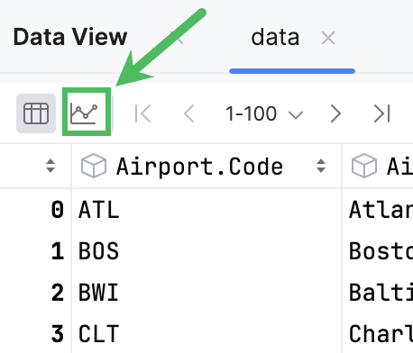
Dataframes and series can be displayed in tabular or graphical form. By default, tables are shown. To toggle the view mode, use the corresponding icons in the upper left corner.
To open the table search bar, click the table and press Ctrl0F.
To open the context menu, right-click the column name:

To copy the column name to the clipboard, select Copy Column Name.
To select the entire column, select Select Column.
To hide a column, select Hide Column. Hide Other Columns will hide all columns except the selected one.
To display hidden columns, click Columns List CtrlF12. The hidden columns are shown strikethrough. Select a column and press Space to toggle its visibility. To search through the column list, start typing a column name in the Columns List window.
To assign a language to a column, use Set Highlighting Language. For more information, refer to Inject a language for a column.
To toggle and configure cell coloring, click Table Coloring Options.

To sort the table data based on the column values, you can either click the column name or select Ascending or Descending from the ORDER BY section in the context menu.
To add another column to sorting, you can either click the column name while pressing Alt or select Ascending or Descending from the Add to ORDER BY section in the context menu.
The data will be sorted by selected columns.
note
Value column cannot be added to sorting if sorting by the index column is active.
State
Description

Indicates that the data is not sorted in this column. The initial state of the sorting marker.

The data is sorted in the ascending order.

The data is sorted in the descending order.

The number to the right of the marker (1 on the picture) is the sorting level. You can sort by more than one column. In such cases, different columns will have different sorting levels.
Click Open Filter View in the upper-right corner of the table.
In the dialog that opens, select the column where you want to apply the filter and specify the filter criteria.

tip
You can add your existing variables from RunTime or create a new variable right in the Enter value field.
If you want to use additional filters, click Add filter and specify the new filter criteria.
Click Apply to filter data.
To remove or duplicate a filter, click Additional Filter Actions and select the required option from the list.
Click
More Actions and select Format Table...
In the dialog that opens, specify the format and click OK.

PyCharm supports Python 2 formatting syntax.
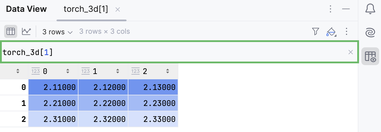
You can use Expression Input to display multidimensional data in a two-dimensional table format.
Click
More Actions and select Show Expression Input.
Write your expression in the input field that appears on top of the table and press Enter.
By default, column statistics are turned off.
To change the default mode to Compact or Detailed, navigate to Settings | Languages & Frameworks | Tables.
The Compact mode includes only Missing and Count statistics:
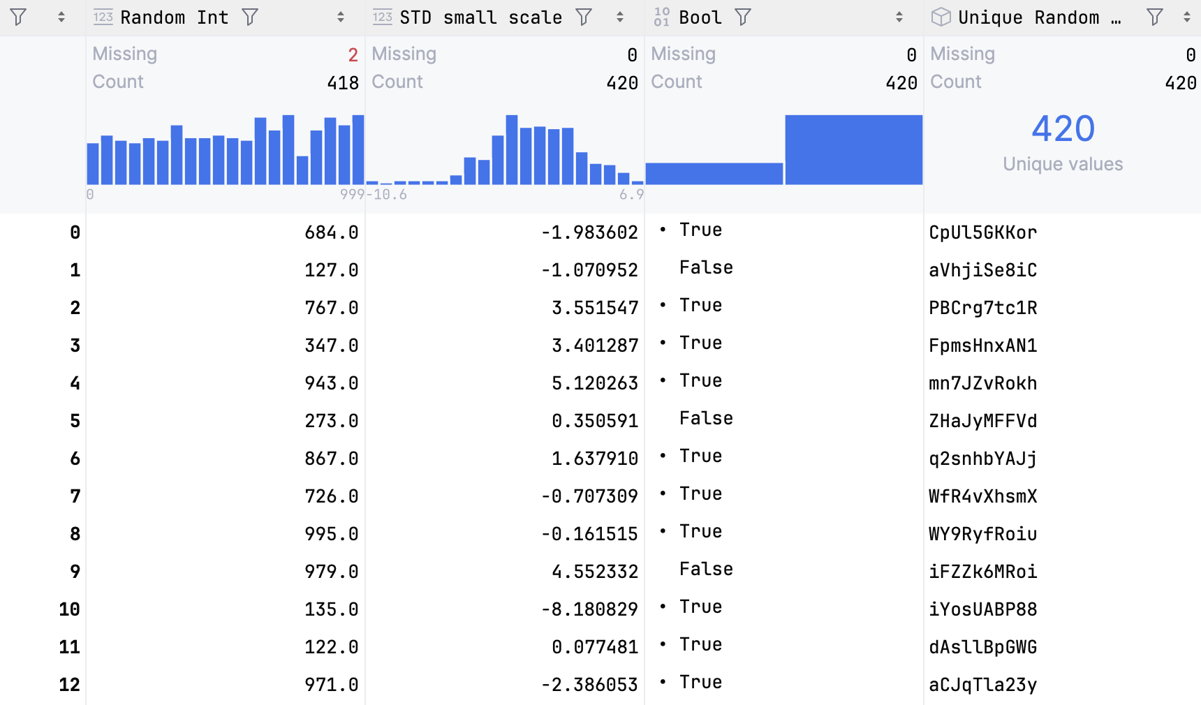
For numeric data, histograms are plotted and shown together with statistics. Hover over the histogram to view detailed information about each bar.
To view detailed column statistics, do one of the following:
Hover over a column name. A popup with column statistics appears.
Click
Show Column Statistics and select Detailed.
The detailed statistics are shown above the columns.
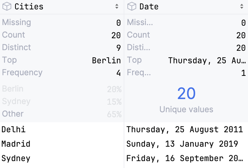
- Data type
Shows the data type the column belongs to
- Missing
Shows the number of
Nonevalues in the column- Count
Shows the total number of items in a column
- Distinct
Shows the number of unique values
- Top
Shows the most popular value
- Frequency
Shows the number of times an element occurs
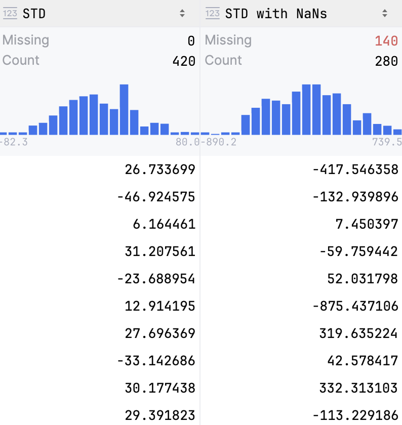
- Data type
Shows the data type the column belongs to
- Missing
Shows the number of
Nonevalues in the column- Count
Shows the total number of items in a column
- Mean
Shows the average number of all values in the column
- Std. Deviation
Shows the standard deviation value
- Min
Shows the minimum value in the column
- Pctl
Shows values for 5th, 25th, 50th( Median) and 95th percentiles
- Max
Shows the maximum value in the column
note
Viewing column statistics in table outputs is equivalent to using the
describe()method forSeries. For more information, refer to pandas.Series.describe and polars.Series.describe.
To view dataframes or series in a graphical form, click Show Chart.
The data will be displayed in the form of a chart. You can change the type of chart and configure additional settings.
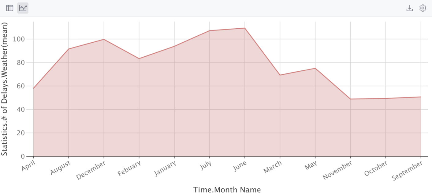
Click
Show series settings to change the initial settings of the chart.
Select the chart type and configure the settings. You can choose one of the following chart types:
Bar
Pie
Area
Line
Scatter
Bubble
Stock
AreaRange
Histogram

Click the Add new series link to add more series to the chart.
Click
Export to PNG to save the generated chart in the .png format.
Enter the filename and click Save.
Data visualizations are displayed in the Plots tool window, allowing you to resize it and to zoom it in and out.
To save a plot, right-click the preview thumbnail and select Save as Image or Save All Plots from the context menu.

When stopping on a breakpoint, the plot being debugged appears in the Plots tool window. See the Debug section of the Data Science project tutorial.
Matplotlib and Plotly are also available in the console. See the Running in console section of the Data Science project tutorial. When starting a Python console (Tools | Python Console...), one can import required packages and build graphs as required:
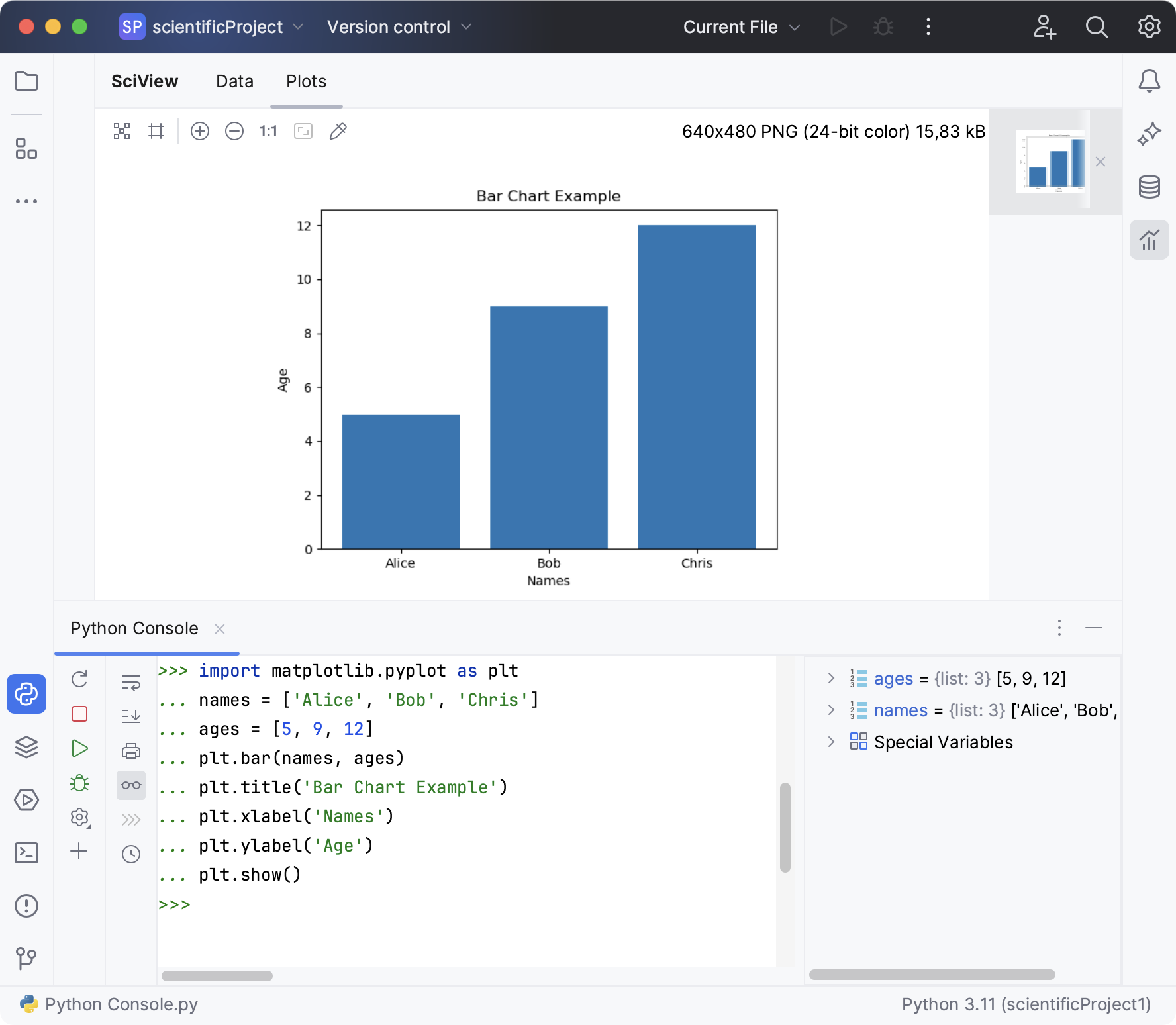
The Python console is accessible for further inputs.
Thanks for your feedback!