Scientific project
Last modified: 11 February 2024warning
The following is only valid when the Python plugin is installed and enabled.
To perform scientific computing and data visualization, select the Scientific project type in the New Project wizard.
When choosing the Scientific project type, you need to ensure that you have conda installed. Once this is done, all you need is to specify the project name. You can also alter the name of the data folder if needed.
Note that to work with Matplotlib, Numpy, or or pandas, you need to install these packages on your Python interpreter.
Analyzing data
View data structures
When viewing variables in the Python Console, you can click View as Array, View as DataFrame, or View as Series links to display the data in the Data View tool window.

By default, the new table representation is used. Click
Switch Between Table Representations to change the table interface.

note
IntelliJ IDEA will remember your choice and use the selected table representation in the future with the following exceptions:
Multidimensional arrays will be displayed using the old representation
Large data structures will be temporarily displayed using the old representation
Data structures from the newly supported libraries (for example,
polars) will be displayed using the new representation
Click
Table Coloring Options to toggle and configure cell coloring .

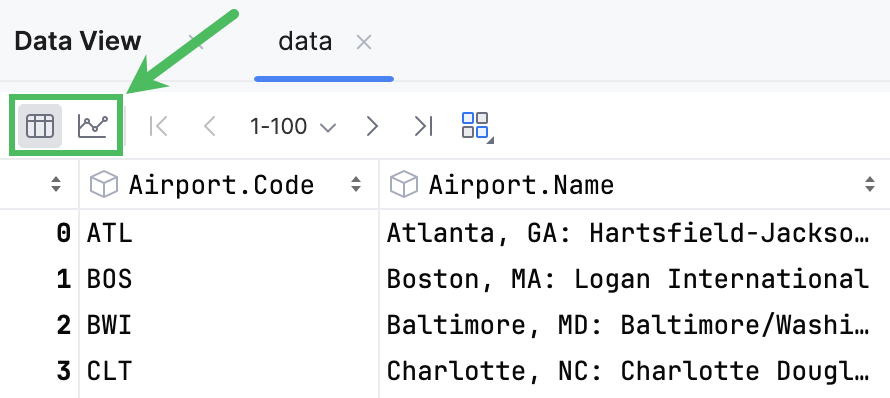
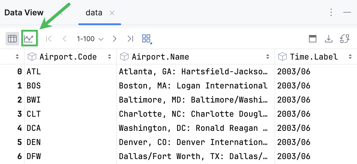
Dataframes and series can be displayed in tabular or graphical form. By default, tables are shown. To toggle the view mode, use the corresponding icons in the upper left corner.

Working with tables
Right-click the column name to open the context menu:

To copy the column name to the clipboard, select Copy Column Name.
To select the entire column, select Select Column.
To hide a column, select Hide Column. Hide Other Columns will hide all columns except the selected one.
To display hidden columns, click Columns List CtrlF12. The hidden columns are shown strikethrough. Select a column and press Space to toggle its visibility. To search through the column list, start typing a column name in the Columns List window.
To assign a language to a column, use Set Highlighting Language. For more information, refer to Inject a language for a column.
Sort data
To sort the table data based on the column values, you can either click the column name or select Ascending or Descending from the ORDER BY section in the context menu.
To add another column to sorting, you can either click the column name while pressing Alt or select Ascending or Descending from the Add to ORDER BY section in the context menu.
The data will be sorted by selected columns.
note
Value column cannot be added to sorting if sorting by the index column is active.
State
Description

Indicates that the data is not sorted in this column. The initial state of the sorting marker.

The data is sorted in the ascending order.

The data is sorted in the descending order.

The number to the right of the marker (1 on the picture) is the sorting level. You can sort by more than one column. In such cases, different columns will have different sorting levels.
View column statistics
Hover over a column name. A popup with column statistics appears.
For non-numeric dataFor numeric data
- Data type
Shows the data type the column belongs to
- Missing
Shows the number of
Nonevalues in the column- Count
Shows the total number of items in a column
- Distinct
Shows the number of unique values
- Top
Shows the most popular value
- Frequency
Shows the number of times an element occurs

- Data type
Shows the data type the column belongs to
- Missing
Shows the number of
Nonevalues in the column- Count
Shows the total number of items in a column
- Mean
Shows the average number of all values in the column
- Std. Deviation
Shows the standard deviation value
- Min
Shows the minimum value in the column
- Pctl
Shows values for 5th, 25th, 50th( Median) and 95th percentiles
- Max
Shows the maximum value in the column
note
Viewing column statistics in table outputs is equivalent to using the
describe()method forSeries. For more information, refer to pandas.Series.describe and polars.Series.describe.
Working with charts
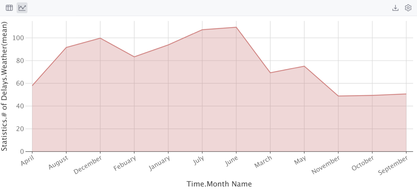
To view dataframes or series in a graphical form, click Show Chart.

The data will be displayed in the form of a chart. You can change the type of chart and configure additional settings.

Configure charts
Click
Show series settings to change the initial settings of the chart.
Select the chart type and configure the settings. You can choose one of the following chart types:
Bar
Pie
Area
Line
Scatter
Bubble
Stock
AreaRange
Histogram

Click the Add new series link to add more series to the chart.
Save a chart as an image
Click
Export to PNG to save the generated chart in the .png format.
Enter the filename and click Save.
Building matplotlib charts
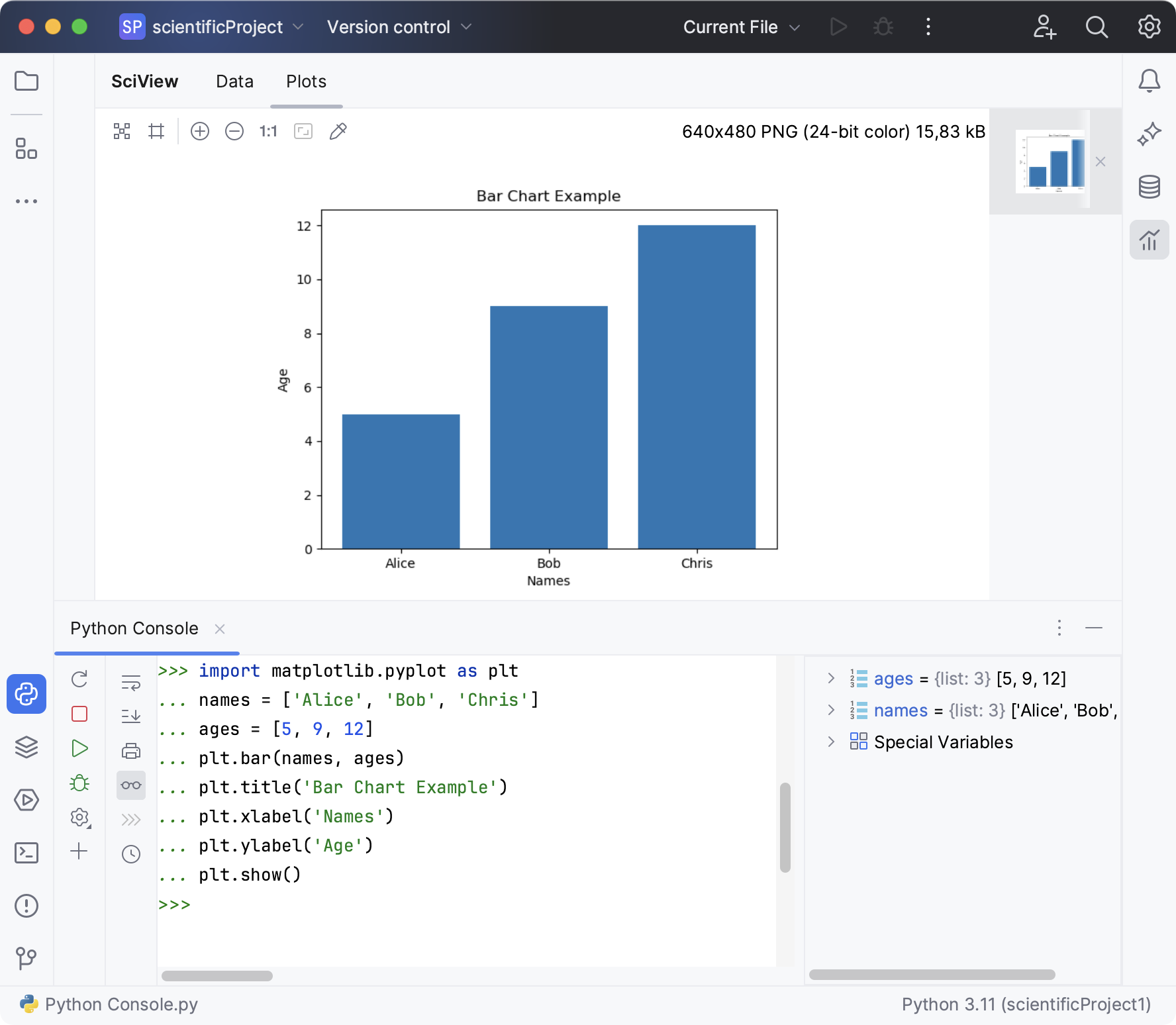
Graphs are displayed in the Plots window, allowing you to resize it, and to zoom it in and out.

When stopping on a breakpoint, the plot being debugged appears in the Plots tool window. See the Debug section of the Scientific project tutorial.
Matplotlib is available also in console. See the Running in console section of the Scientific project tutorial. When starting a Python console (Tools | Python Console...), one can import Matplotlib, and build graphs as required:

The Java console is accessible for further inputs.
Thanks for your feedback!