Build advanced visualizations
Use chart cells to build customizable visualizations based on DataFrames in your notebooks. With this feature, you can do the following:
Plot multiple DataFrames on one canvas
Choose from the point, line, bar, area, correlation, and regression chart types
Use full or auto-sampled datasets
Customize the width, height, title, and axis labels of your chart
Choose from the reverse, continuous, discrete, sqrt, and log10 scale types
Visualize tab and chart cell compared
While both elements allow you to plot your data quickly and with no coding involved, they are not the same:
Visualize tab: Plotting is performed on the client side. Created visualizations are mainly used for quick exploratory analysis on sampled datasets. Find more information in Use automatic plotting.
Chart cells: Plotting is performed on the server side. The feature facilitates collaboration and allows to build multilayered charts based on datasets of any size.
Build a simple chart in a chart cell
Before the procedure, make sure you have a DataFrame for plotting.
Open a chart cell:
Right-click anywhere in the editor field, hover over Insert cell below or Insert cell above and select Chart.
Hover over the bottom border of a cell, click More, and select Chart.
In the added chart cell, expand the Select data list and select the source of data for your chart.

In the Title field, provide a chart title.
(Optional) To customize the basic chart properties, click the settings icon in the Title field. In the Plot settings dialog, you can set the width and the height of the chart, and select if you want the plot updated automatically on the changes you make and if you want to use auto sampling.

(Optional) To change the data source, expand the Data list to select a new option.
Expand the Type list to select a chart type. Line is the default option.
Expand the Color list to pick a color for your chart or configure the palette based on the data from a selected column.
Set up the chart axes. Expand the X axis and Y axis lists to select columns as data sources.
(Optional) Customize the axes:
Click the settings icon for the respective axis.
In the axis settings dialog, you can provide an axis label, select a scale type, provide a number of bins (if applicable).
Click Apply.

Build a layered chart in a chart cell
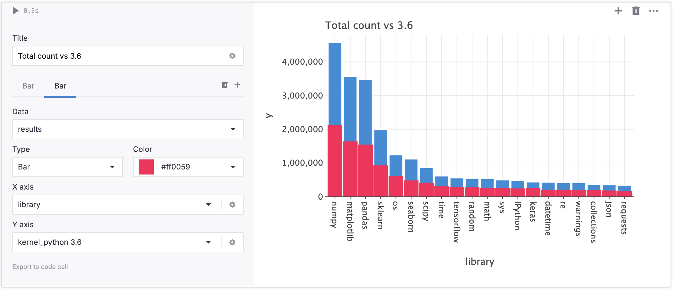
You can build charts with several layers based on different plots.
In a chart cell, click the plus icon under the Title text field. This will add a tab for one more layer.

Remain on the newly added tab and set up the chart as instructed in the procedure above. You can switch from tab to tab to edit all charts on the canvas.
(Optional) To remove a layer, switch to the layer tab and click the Remove icon on the tab toolbar.
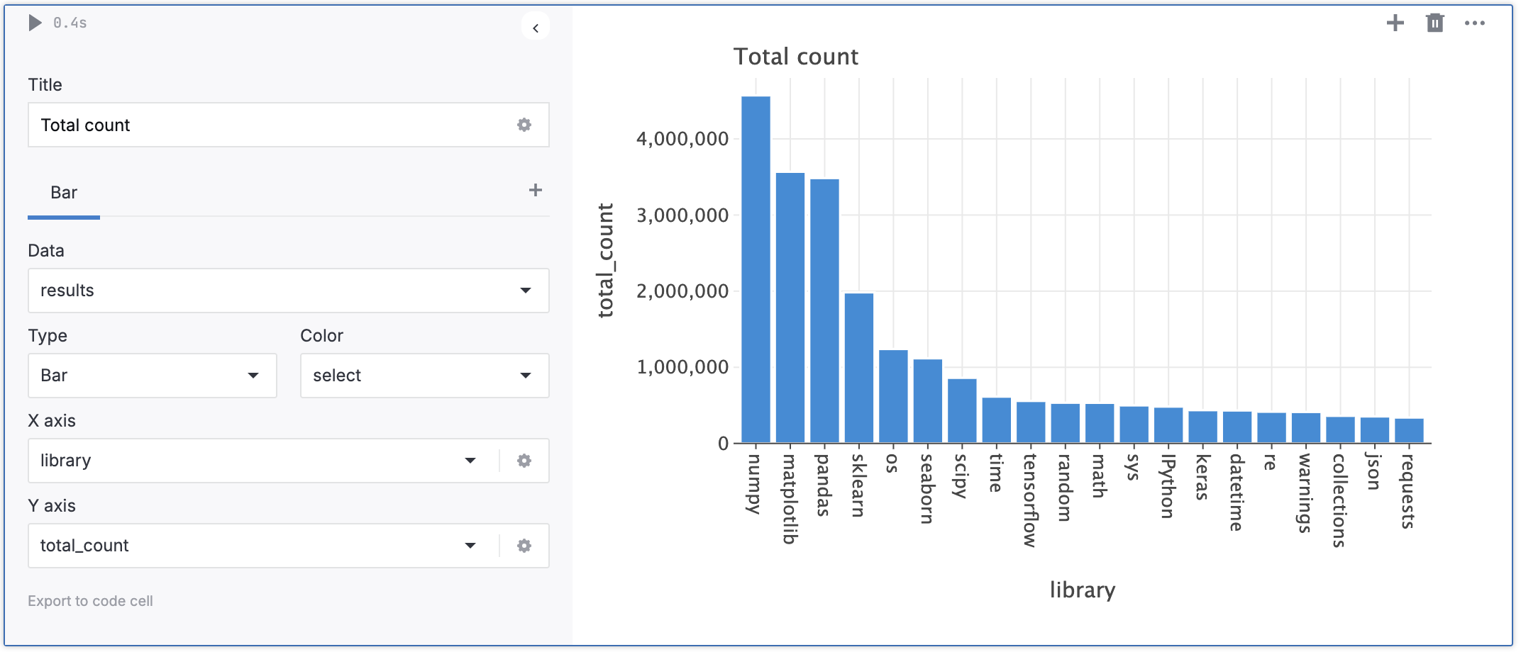
The image below shows two charts: one based on one plot, and one containing two layers with different plots.


How chart cells are exported
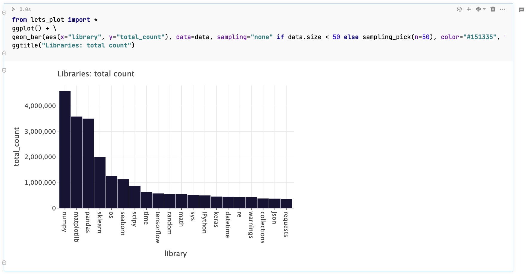
When exporting a notebook to .ipynb, the chart cells are converted into code cells with their input extracted as code for building the respective visualizations. This ensures that you can create the same charts once you open and run the exported notebook.
Below is an image showing a code cell with code extracted from a chart cell.
You can also export a chart cell into a code cell by clicking Export to code cell in the lower left corner of the chart cell.

Keywords
advanced charts, customize charts, advanced graphs, multiple plots